Background
Couchsurfing is a community platform that connects travelers with hosts offering free accommodation and hospitality. Through this platform, travelers can connect with locals at their destination, and hosts can make friends from all over the world.
What's the problem?
Couchsurfing, while it has always been a niche way to travel, has been declining in popularity over recent years and is almost unheard of in U.S. communities. Despite it being an American company, the platform has found little success compared to its use abroad in European countries.
Understanding why
American audiences tend to be more reluctant to host guests and participate in couchsurfing culture. Is it because this method of traveling has less public exposure, or is it due to the social perception of staying with strangers in an unknown environment? It could be both, but in this case study, we'll focus on how the app is perceived by users and how users feel on the platform.
What are users saying? Here's what we found.
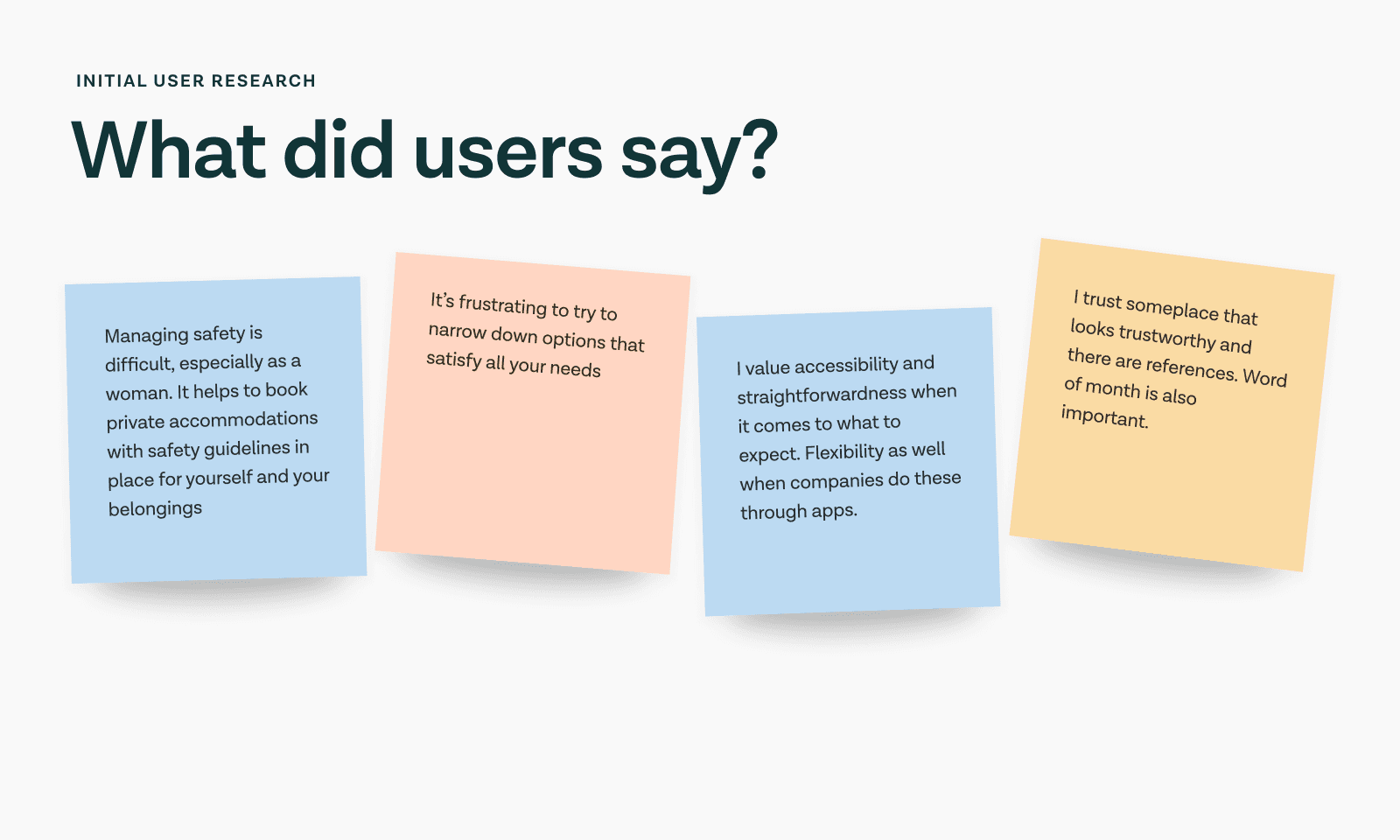
We interviewed 8 individuals with varying levels of travel experience, including those who were interested in hosting/traveling and those only interested in traveling. From these interviews, we discovered that many users expressed concern about managing their safety while traveling, particularly when discerning the trustworthiness of accommodations. Other interviewees found frustration in narrowing down accommodation options that satisfy all their needs.
Over half of our interviewees said they value their safety when travel booking.
Problem Statement
With these insights, we brainstormed How Might We statements and built a problem statement
How might we create a trustworthy environment for finding accommodations, ensuring that Couchsurfing users feel safe, supported, and connected to local experiences?
Methods
Methods that were used in this project to further understand the root of users' pain points were:
HMWs (How Might We) – to brainstorm the big picture of the project and the benefits users will get from the app redesign.
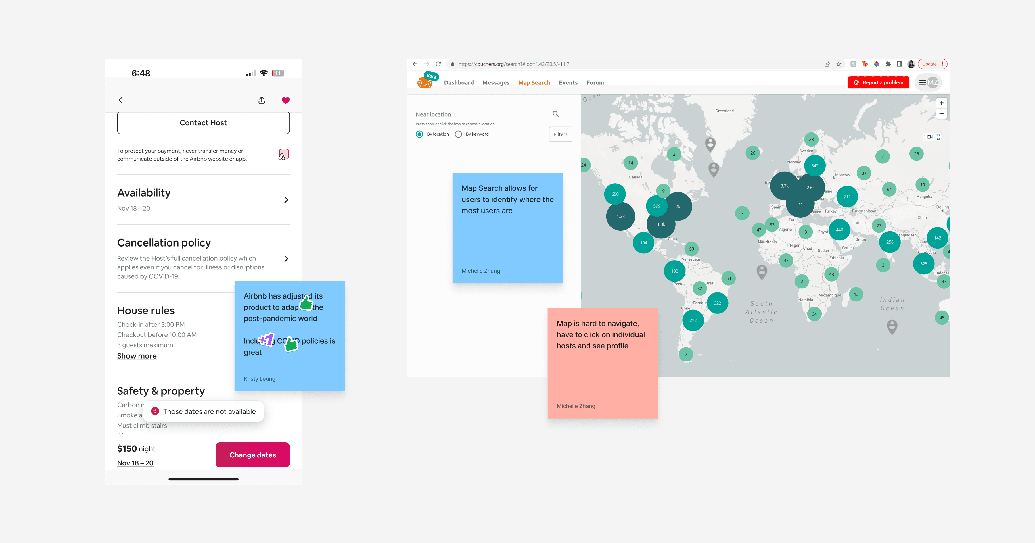
Competitor Analysis – to discover features on other platforms that rival Couchsurfing and to determine which were helpful in browsing and selecting accommodations.
User Interviews – to gain insight into what travelers and hosts value in travel accommodations and overall travel experience.
Storyboarding & Crazy 8s – to visualize the user flow and generate ideas for app features that promote safety and filtering.
MoSCoW method – to decide what ideas to implement and the priority.
User Testing – to walk through several flows for fine-tuning and identify areas for improvement.
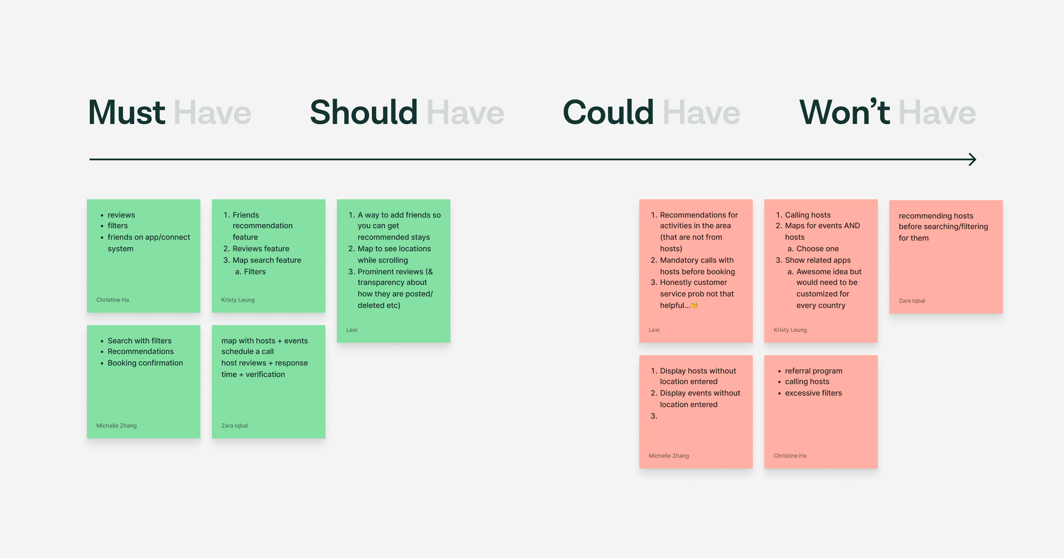
We decided on four main features
Onboarding: Simplify the registration process to make it more intuitive and engaging by connecting with friends.
Search and Filters: Enhance the search functionality by incorporating advanced filters.
Messaging: Improve the messaging feature for more direct communication between hosts and travelers.
Profiles: Revamp host profiles to include comprehensive information about their background, verification status, hosting experience, and reviews from previous guests.
Prototyping & Testing
During the prototyping phase, we transitioned from lo-fi to hi-fi and made significant changes in between the phases to improve access to traveler information, simplify processes, and refine profiles to minimize clutter.
We tested our prototype flows with 10 individuals and synthesized the feedback into three insights.

Branding Design
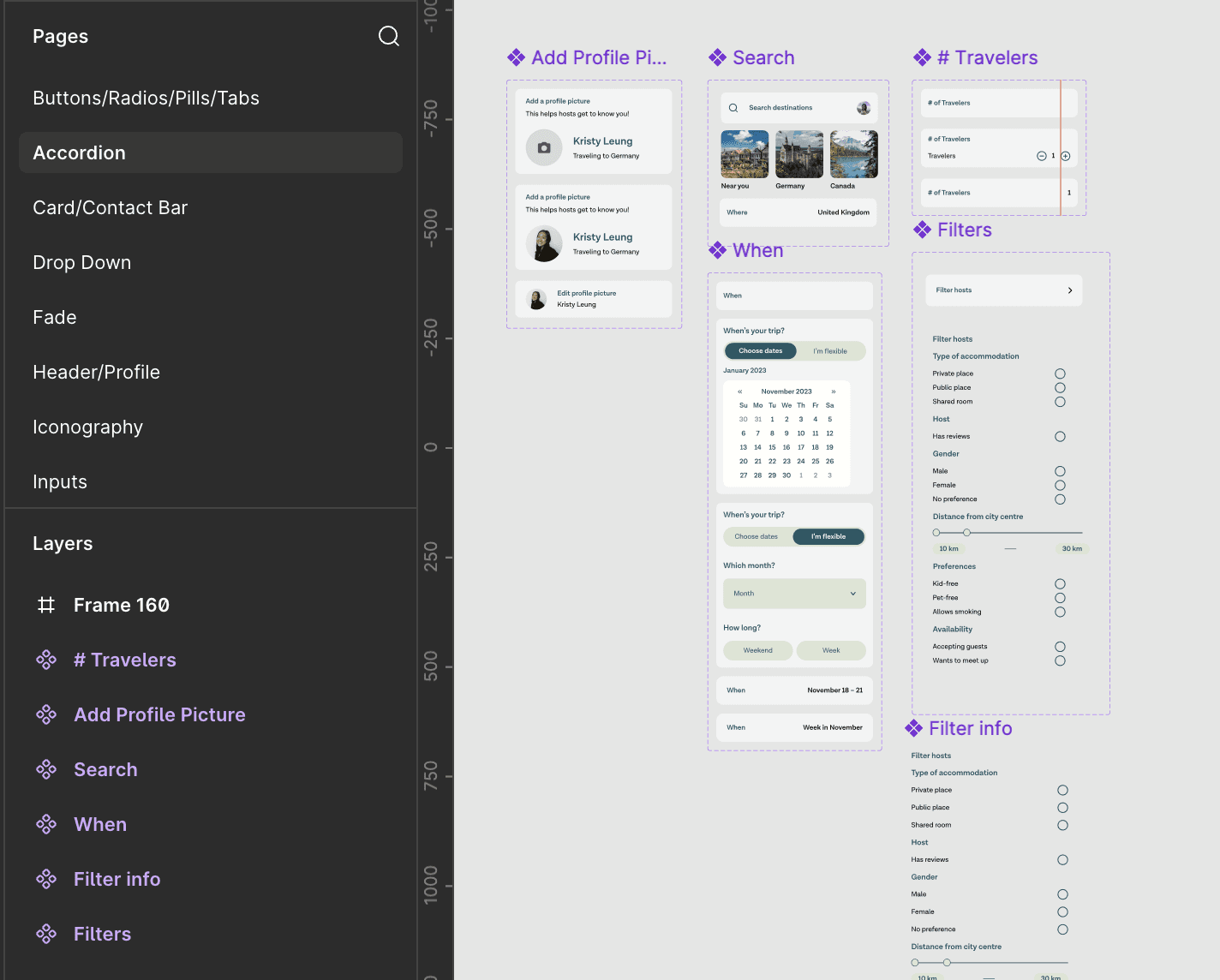
Honing in on a style guide, we included a color palette that matched the “wanderlust” aesthetic of Couchsurfing and a typeface that was both legible and quirky.

Design System
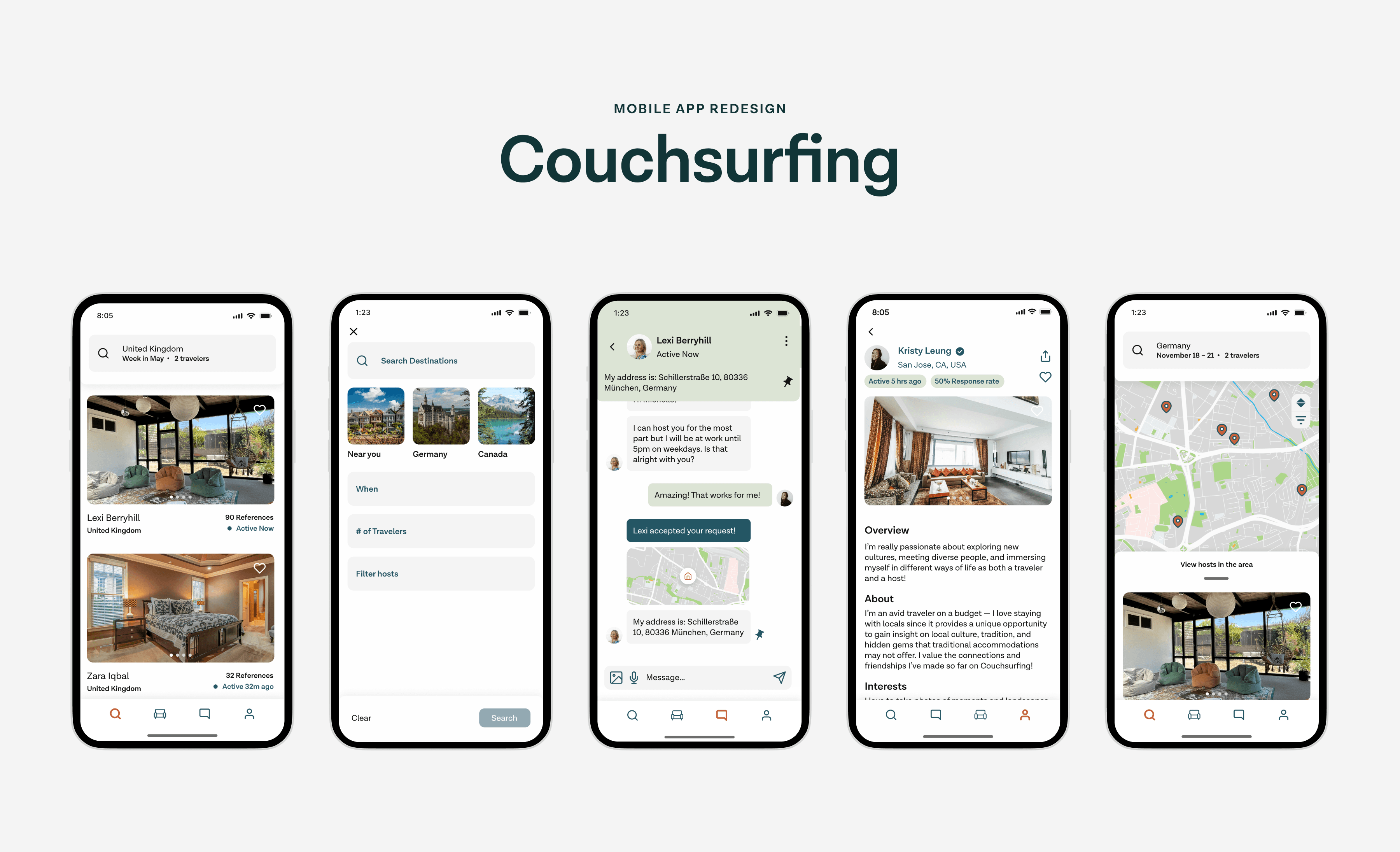
The final prototype features 6 flows:
Onboarding – Provides clarity to users on how to use the app
Home/Search – Helps solve users' frustrations over filtering accommodations
Booking/Request – Requests keep hosts safe, and travelers get details about the accommodation
Messaging – Improves host and traveler communication
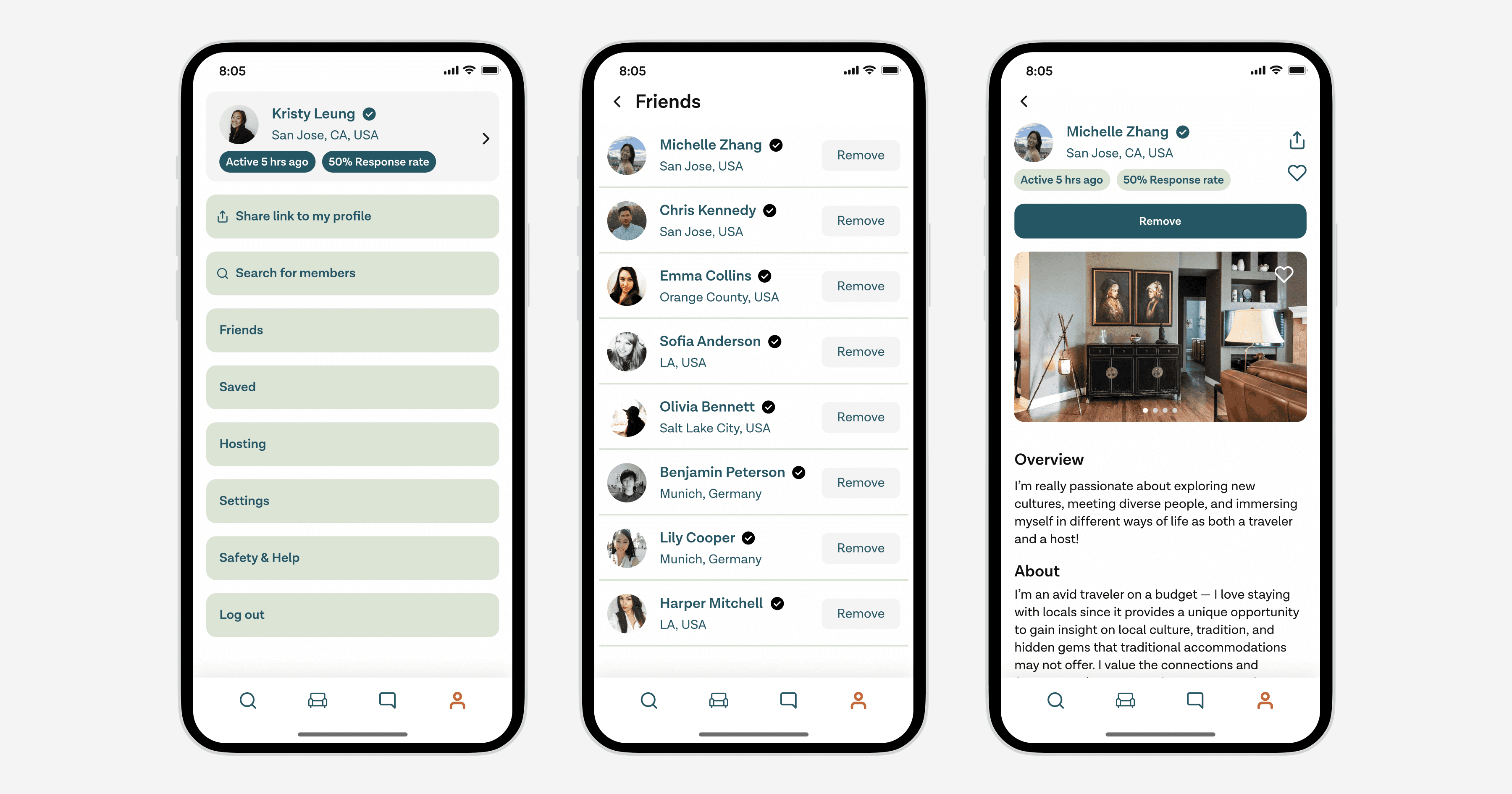
Profile/Settings – A hub to manage account settings and look at your reviews
Review – Rating other users on the platform shows off credibility
Lessons Learned
Avoid tunnel vision.
There were moments when we would hyperfixate on a feature that's considered lower priority. It made me realize how important it is to remember the scope of the project. There are many features and improvements we can implement, but it's best to be realistic about the timeframe and our resources.
Prioritize what's important and don't get stuck in the details, especially in early iterations.
It's important to prioritize the main deliverable and put details aside so you can move forward. There will be mistakes and pixels misaligned, but you have to remember to bookmark it and come back to it at later stages.